White walls don’t have to feel blank or boring, they’re actually a designer’s secret weapon. In 2026, the minimalist approach to white wall decor is thriving, especially among homeowners who want a calm, cohesive backdrop without the commitment of bold colors. The challenge isn’t filling white walls: it’s doing it thoughtfully. This guide walks through seven practical strategies to layer in visual interest, texture, and personality. Whether you’re working with fresh drywall, rental constraints, or a deliberate design choice, these white wall decor ideas will help you build a space that feels intentional and lived-in, not sterile.
Table of Contents
ToggleKey Takeaways
- White wall decor works best when layered with texture, light, and focal points—turning a blank canvas into an intentional, designed space rather than a sterile room.
- Texture is essential in all-white rooms: incorporate woven wall hangings, linen fabrics, removable wallpaper, or mixed fiber types to add visual warmth and depth.
- Strategic lighting—including picture lights, wall sconces, and uplighting—creates shadows and dimension that enhance white walls throughout the day and highlight textural elements.
- Gallery walls and framed artwork should follow a cohesive design thread (consistent frames, mats, or theme) and be measured and sketched on kraft paper before installation to avoid drywall damage.
- Floating shelves at varying heights with thoughtfully grouped objects (styled in odd numbers with mixed heights) and mirrors create functional storage that combats flatness while maintaining a clean aesthetic.
- Plants, mirrors, and reflective metallic accents (brass, copper, or gold) break up white monotony and add visual richness by bouncing light and introducing natural color contrast.
Why White Walls Are The Perfect Design Canvas
White walls are polarizing. Some see them as blank slate, others as blank stare. The truth: they’re one of the most flexible design foundations you can choose. They reflect light, making rooms feel larger and brighter, especially useful in smaller spaces or rooms with limited natural light. White also allows every other element to stand out. A piece of art, a floating shelf, or a texture pops harder against a white background than it would against navy or greige.
From a practical standpoint, white is forgiving. It masks imperfect drywall finish and doesn’t show dust or minor wall damage the way darker colors do. If you’re renting, white is easier to repaint back to landlord-standard than a jewel tone. And resale-wise, white walls are neutral enough that future buyers can envision their own style, which matters when you’re selling.
The real design challenge with white isn’t the color: it’s the flatness. Plain white on white gets dull fast. The solution isn’t adding color: it’s adding layers: texture, dimension, shadow, and focal points. That’s where the next strategies come in.
Layering Textures and Patterns for Depth
Texture is what saves all-white rooms from feeling cold. When you remove color, your eye hunts for contrast through surface variation. This is where raw wood, linen, concrete, plaster, and woven elements shine.
Using Fabrics, Woven Elements, and Wall Hangings
Woven wall hangings, macramé, woven tapestries, or textile art, add immediate warmth and dimension to white walls. These pieces catch light differently depending on the angle and time of day, creating shadow and visual movement. Hang them at eye level (roughly 57–60 inches from the floor to the center of the piece) so they command attention without overwhelming the wall.
Fabrics also soften hard surfaces. A linen throw draped over a white shelving unit, a cotton rug layering the floor beneath, or canvas art prints all introduce tactile interest. Mix fiber types: smooth linen next to chunky knit, matte next to subtle sheen. This variation is what makes white-on-white feel designed rather than default.
Stick-on wallpaper or removable peel-and-stick shiplap can add linear texture without commitment. These products have improved dramatically and now offer realistic wood grain, subtle tile patterns, and woven finishes. If renting, this is your friend: if you own, it’s a budget option for testing texture before committing to permanent treatments. Installation is straightforward, measure twice, apply once, smooth out air bubbles. Most hold for years and peel cleanly when you’re ready to change.
Gallery Walls and Framed Artwork
A gallery wall is the working artist’s answer to blank white space. The key is restraint. Too many frames at different angles and sizes reads chaotic: a thoughtful grid or salon-style arrangement reads intentional. Gallery walls work best when every piece shares a visual thread, all black frames, all white mats, a consistent color accent (say, warm neutrals or pastels), or a theme (botanical prints, travel maps, family photography).
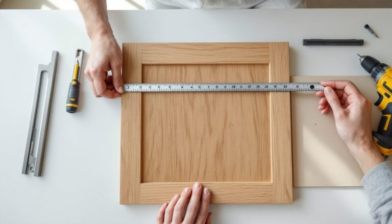
Measure before you drill. Sketch the layout on kraft paper, tape it to the wall, and live with it for a few days. This catches spacing mistakes before you’ve got seven holes in drywall. Use a level for each frame. Crooked art is one of those details that nags your eye every time you walk into the room.
For DIY artwork and wall decor solutions, print your own pieces or commission them affordably online. Black-and-white photography, line drawings, botanical etchings, and typographic prints all read sophisticated and timeless. Mix framed art with unframed prints on ledges or leaning against the wall for a lived-in feel. The unframed approach also lets you rotate pieces seasonally without rewiring the wall.
Lighting as a Decor Statement
Light isn’t just functional, it’s the most powerful decorative tool in your arsenal. On white walls, strategic lighting creates shadows, defines depth, and changes how the room reads throughout the day.
Picture lights above framed artwork throw warm light and shadow across the wall, emphasizing texture and frame depth. Wall sconces flanking a mirror or artwork create symmetry and visual weight. Pendant lights or sculptural fixtures become art themselves when hanging against a white backdrop. Choose finishes that complement your textures: matte black, brushed brass, or natural wood add contrast and warmth.
Consider the color temperature of your bulbs. Warm white (2700K) feels intimate: cool white (4000K) feels crisp and modern. Layer your lighting: overhead for task work, wall sconces for ambiance, accent lighting for artwork. This layering prevents any one light from flattening the room.
Wall uplighting, a sconce pointing upward, throws light across texture and creates a subtle glow. This technique is borrowed from high-end interiors and costs nothing beyond the fixture itself. Install according to manufacturer specs: most are simple standard installations requiring basic electrical knowledge or a licensed electrician if you’re uncomfortable with wiring.
Shelving, Floating Displays, and Functional Decor
Floating shelves aren’t decoration, they’re architecture. They break up blank wall space, create horizontal lines, and give you room to display objects that matter. Install shelves at varying heights on the same wall to add rhythm. Standard heights are 10–12 inches apart, but stagger them for visual interest: one shelf at 36 inches, another at 48 inches, another at 60 inches (measured from the floor to the shelf bottom).
Shelving requires proper installation. Floating shelves need a wall stud or heavy-duty anchors rated for your load. Hollow wall anchors rated for 50+ pounds work for lightweight displays: structural shelves need a stud. Find studs with a stud finder (electronic models run $15–40 and take the guesswork out). Drill pilot holes, use the correct fastener type, and check level before loading.
What goes on shelves matters as much as the shelves themselves. White objects (books with white spines, white ceramics, white sculptural pieces) disappear into white walls, that’s not always bad, but vary it. Group objects in threes or fives, an odd number feels more organic than pairs. Mix heights: stack books, stand a framed photo, lean a print, place a sculptural object. This variation creates visual movement and stops your eye from reading one flat plane.
Consider floating shelves as functional storage too. Woven baskets on white shelves add texture, hide clutter, and maintain the clean aesthetic. This approach borrowed from minimalist design trends marries form and function, shelves work hard and look intentional.
Plants, Mirrors, and Reflective Elements
Live plants are the antidote to sterile white walls. Green foliage creates color contrast, brings life, and softens edges. Install a wall-mounted plant shelf or lean potted plants against the wall on a floating shelf. Trailing plants like pothos or string of pearls cascade down, creating movement and depth.
Mirrors are game-changers. A large mirror reflects light, expands perceived space, and adds shimmer against flat white walls. Position mirrors opposite or near windows to bounce natural light around the room. Ornate frames add character: minimal frames keep things modern. A mirror leaning against a wall (rather than hung) is easier to adjust and feels casual, which works perfectly for white wall schemes.
Reflective surfaces don’t stop at mirrors. Metallic accents, brass, copper, chrome, or matte gold, catch light and add visual richness. A gold-framed plant pot, a brass wall sconce, or a copper wall hanging breaks up the flatness. Glass or transparent pieces (a clear glass vase, a lucite shelf) also play with light and negative space.
For budget-friendly renovation stories and room makeovers, grouping plants and mirrors creates a visual anchor without the cost of art or built-ins. A cluster of three plant shelves with varying greenery, flanked by a couple of mirrors, becomes a living gallery wall. The arrangement changes with seasons and plant growth, keeping the space dynamic.
Bringing It All Together: Practical Next Steps
White walls are a starting point, not a limitation. The design work comes in layering texture, light, and objects intentionally.
Start with one feature wall or corner. Layer in textures first: wall hangings, shelving, or wallpaper. Add lighting that highlights those elements. Then introduce focal points: artwork, mirrors, or plants. Step back, live with it for a week, and adjust. Decor isn’t permanent, move pieces around, swap art, adjust shelf styling.
Measure twice, drill once. Test layouts on paper or kraft before committing. Use the right fasteners for your wall type (drywall anchors for hollow walls, studs for heavy loads). Install shelves level: hang art at eye level. These small technical details are what separate amateur from intentional.
White wall decor in 2026 is about restraint and intentionality. Every piece should earn its place. When you do it right, white becomes not a blank space, but a canvas that showcases everything you layer onto it.